Your home’s colour combinations can impact your mood, and help create a cohesive look with your decor.
But before transforming any plain white walls, there are a few things to consider: starting with is the room for eating, working or sleeping? And what ‘feel’ are you hoping to achieve with the space?
“Colour plays an inherent part in the human psyche,” says interior designer Ann Marie Cousins, owner of AMC Design. “We know that each use of colour will instil a feeling and emotion, and it’s important to channel that into our interiors for it to feel bespoke.
“Your colour story needs to develop throughout the house, both according to the function of the room and also the orientation of the room, and the temperament of the people who would use it the most.
So, what are the hottest colour combinations right now?
Blue and white
Blue and white is a classic colour combination which is seeing a return.
“There is no rule book as such about the emotional impact of blue and white, but the shade combination is important in terms of mood, and we find it’s personal to each client,” says Cousins. “Blue has a reputation that it evokes feelings of the cold, but it very much depends on the hue. Just think of the difference between the blue of the Aegean Sea versus the grey-blue of the North Sea.”
So, how do you know which blues to choose?
“Think about the mood you wish to create in your space. If you would like an elegant room, consider a rich navy with white panelling and flecks of mustard textiles to create a sophisticated and restful feel,” says Cousins. “However, if you prefer a more joyful and energetic scheme, opt for a light turquoise-like blue ground by F&B, paired with a soft white, like strong white, which will make you feel uplifted.
“When choosing the right shades for your walls or ceilings, always test the colour first. A blue with a slightly cold undertone can look almost grey in a north-facing room, and a white which lacks warmth will look flat and unwelcoming in the same room.
“Plan by buying samples of paint and wallpaper and placing them on the wall for at least two to three days before you commit,” she suggests. “Do remember you will need a disrupter colour to pull the scheme together. A dash of blush pink can add softness to your navy and white scheme, or a coral throw at the end of the bed can help to elevate and contrast effortlessly.”
Nourishing greens
Bringing nature into our homes shows no signs of slowing down, either.
“We are taking that one step further this year by immersing ourselves in a natural setting and nature scaping with nourishing greens. The concept is to provide a calming and grounding atmosphere which recognises the positive impact of nature on human wellbeing,” says Cousins.
“One of the easiest ways to do this is to select your chosen green colour and combine it with a hue which falls opposite to the green in the colour wheel.
“Pinks, corals and peaches teamed with green replicate gardens in full bloom, and so we are likely to see this emerge as a breakout palette. Dip your toe in and choose green, biophilic wallpaper and coordinating pink textiles, or go bold and colour-drench the room in your chosen green – skirting, doors and all – then complement with a statement pink rug.”

Black and cream accompanied by orange
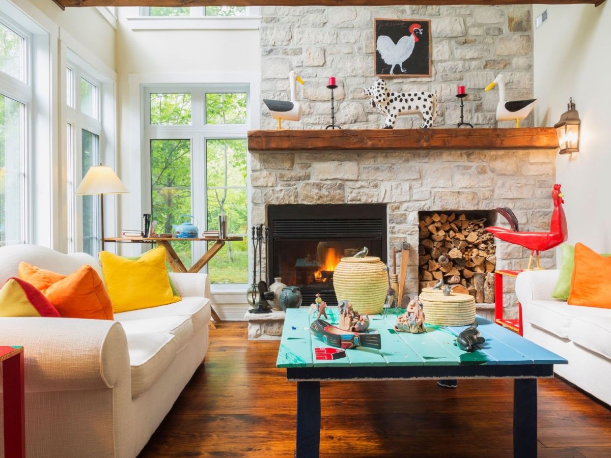
Cream is a staple colour for many designers – a neutral base that feels warmer than white, so is great for living rooms and bedrooms. However, Cousins believes that paired with black and flanked by a burnt orange, this combination can be transformational and lift a flat room in an instant.
“My favourite way to use this pairing is to pick a strong black and cream patterned fabric for curtains or wallpaper for a statement wall, and add a pop of bright orange on a bedhead, layering abstract cushions or accessories,” she says. “This is a perfect way to modernise a dated or Victorian property without having to renovate.”
Go for gold and jewels
Gold is associated with opulence and luxury, and Cousins says the use of gold gilding and gold leaf can really level up the drama in a space.
“A raft of celebrities have chosen to utilise metallics in their homes, so it’s no surprise it’s trending as people replicate the luxe look. When gold is applied in spaces such as bathrooms, bedrooms and kitchens, it needs both a tether colour and also a paired neutral,” she says.
“The complementing hues for gold are jewel-like tones, so a deep teal or sapphire blue can look effortlessly chic, especially in a bedroom or cosy living room, or a gold backsplash in a kitchen set against a moody blue or dark green cabinet and a warm white works so well.”


